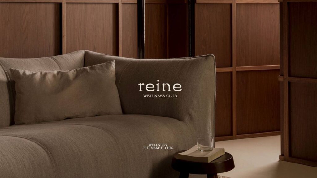
Every new Pilates studio in the city looked like a gym. Reine wanted to look like a hotel bar.
So we built it as a members’ club rather than a fitness brand — walnut, low light, a wordmark set like the stamp inside a coat. Pilates is the product; belonging is what people are actually buying.
Scope Identity, guidelines, applications
Design Wid Karagul
Year 2025
Pilates is not a workout, it's a lifestyle.
Blind deboss on both stocks. No ink on the mark.
The smallest legible use of the wordmark, at 12 mm.
In-studio print. The powder blue is the one unexpected note in the palette.
The palette is the room itself — bleached linen through to almost-black walnut — which lets the photography stay low-lit without the brand looking underexposed.
Wellness, but make it chic.
The full guideline runs to logo rules, colour specification, type hierarchy, photography direction and the complete application suite.